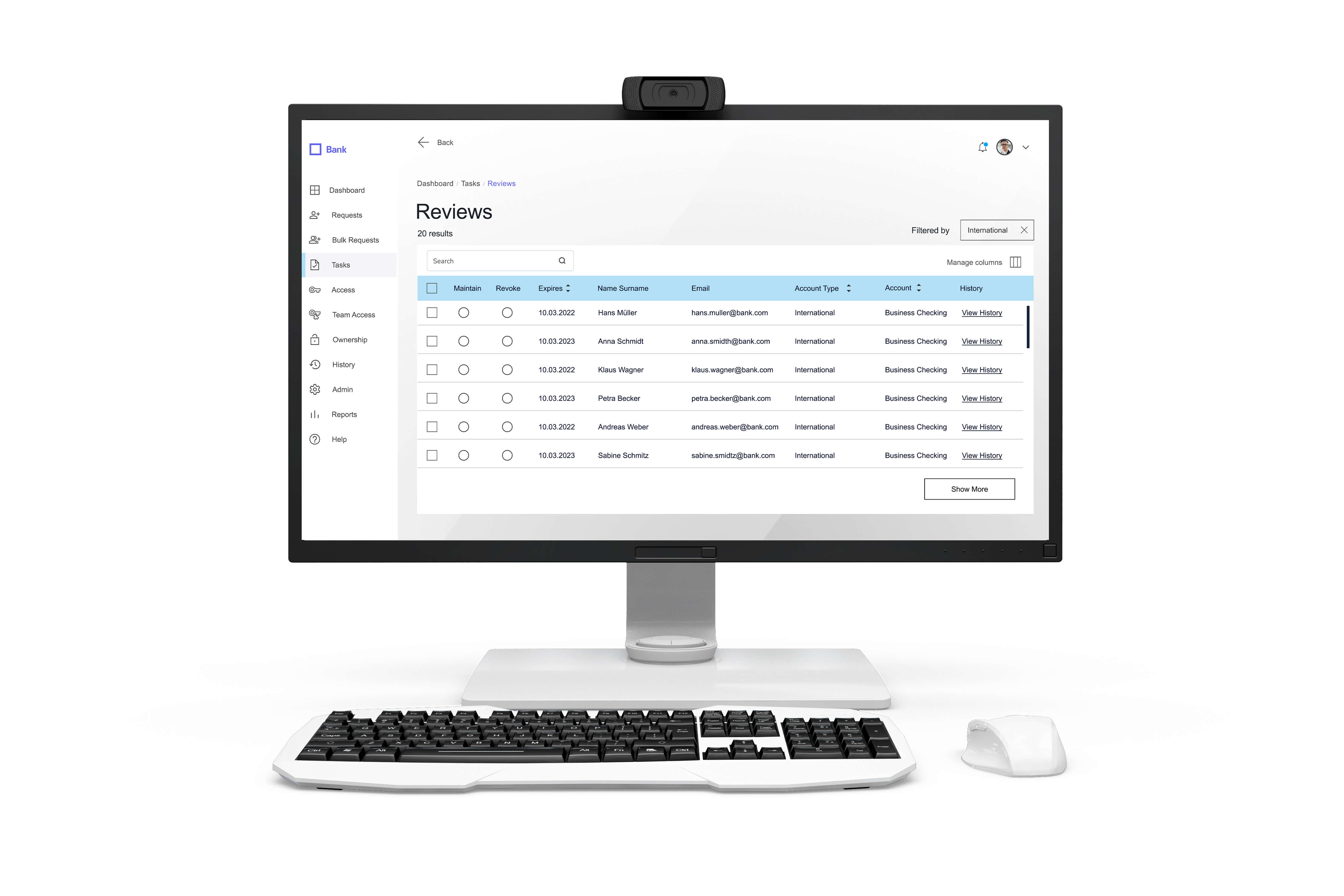
The existing German 🇩🇪 banking platform struggled with navigation issues, inefficient workflows, and accessibility gaps, making everyday tasks frustrating for bank employees and business clients. While a design system was in place, it lacked user research insights and proper documentation, leading to inconsistent usability and decision-making challenges.
This project focused on improving accessibility, streamlining workflows, and enhancing the overall user experience to create a more intuitive and efficient banking platform.
Through interviews and usability tests, we identified three major pain points:
Longer task completion times
Low feature discoverability
High support inquiries
I waste too much time finding the right section. A clearer layout would make my job much easier.
The redesign focused on two key user groups:
By addressing the needs of these users, we ensured a balance between efficiency and ease of use.
In this banking platform redesign, I shifted focus from screen design to system thinking — helping product leadership reduce cognitive load, simplify compliance flows, and resolve user pain points that previously clogged support channels. Instead of layering on UI fixes, we restructured dashboards around decision speed and designed workflows that supported both users and operational KPIs. The outcome? A product that felt faster, clearer, and more purposeful — not just prettier./p>
I followed an iterative, user-centered workflow, adapting the design process as new insights emerged. After laying the foundation with comprehensive research, I worked closely with stakeholders, developers, and end-users to ensure every design decision was validated through testing and aligned with business needs.
My process balanced user insights with business objectives, ensuring each design decision delivered both usability value and measurable operational improvement.
Conducted interviews, stakeholder workshops, and market research to identify UX gaps.
Created intuitive information architecture & structured layouts for seamless interaction.
Expanded the Material Design framework to ensure scalability and consistency, introducing a color token system for a more structured and flexible UI.
Conducted WCAG compliance audits to enhance usability across light and dark modes, ensuring accessibility for all users.
Prototypes were validated through multiple testing cycles, refining the final experience.
A more efficient banking platform. The redesigned website featured:
My co-designer and I contributed to streamlining workflows, enhancing usability, and improving accessibility for bank employees and business clients. The following key metrics highlight the success of our user-centered approach.
Each metric was a direct result of aligning the design strategy with banking workflows, client support reduction, and internal operational priorities.
Usability tests showed employees completed tasks more efficiently with improved workflows.
Avarage clicks reduced from 9 → 6, making navigation smoother and reducing friction.
Improved UI and navigation led to increased engagement and trust.