Public Transportation
Developing a Smart mobility MVP for public transit
Custom Mobile App
Existing public transport apps in Sweden 🇸🇪 caused frustration due to unreliable arrival times, complex trip planning, and poor feature discoverability—leading to missed connections and inefficient journeys.
Our goal was to make daily commutes seamless, stress-free, and efficient. To solve this, we built a user-friendly Smart mobility app MVP that: improved real-time tracking for accurate arrival predictions & Simplified trip planning with an intuitive, streamlined flow.
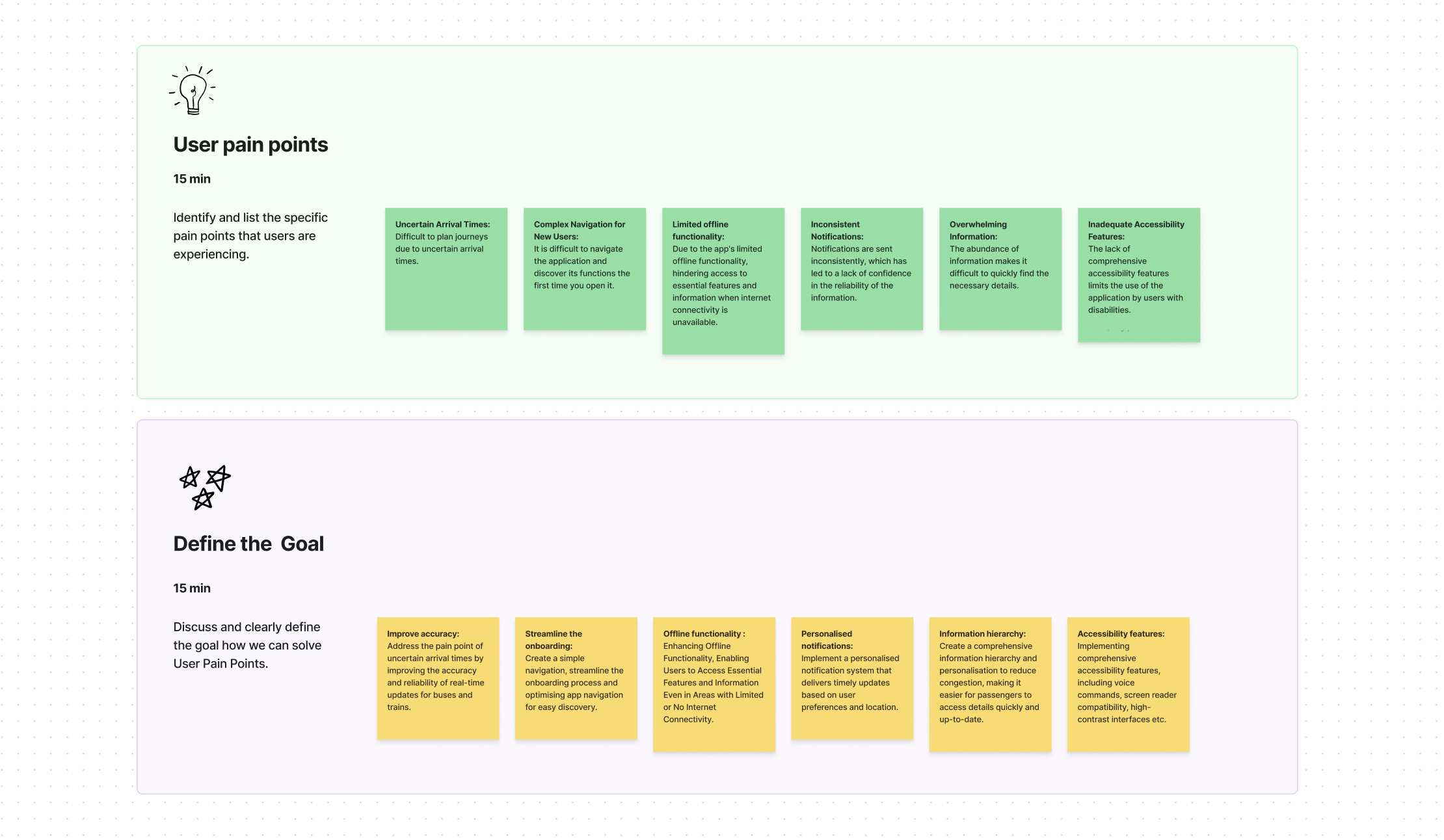
102 user surveys revealed three major problems:
Unreliable arrival predictions
Poor feature discoverability
Complex trip planning
I never know if the bus will arrive when the app says it will. I've missed important meetings because of this, and it's incredibly frustrating to stand in the cold not knowing when—or if—my bus will come.
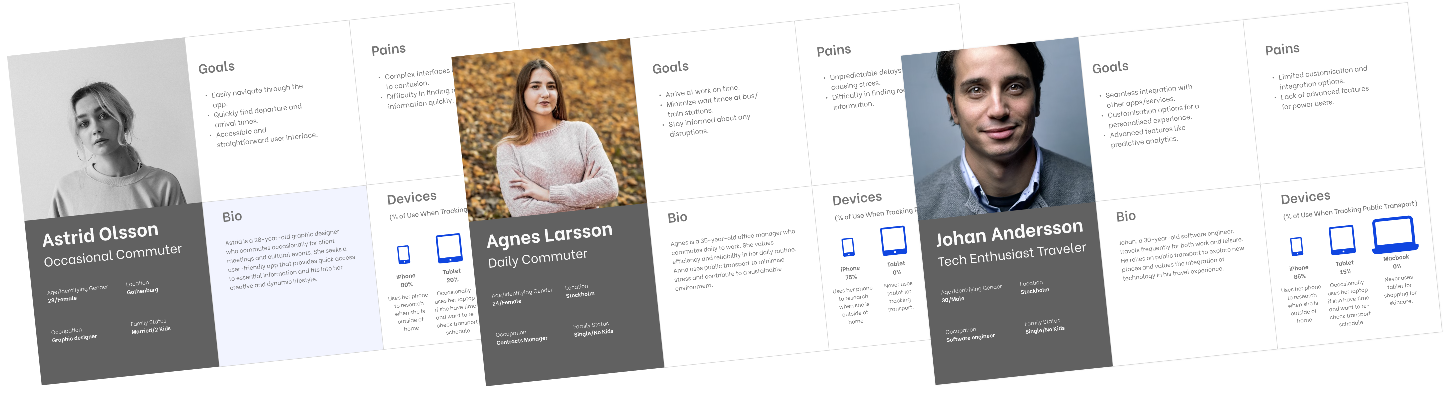
Our research identified commuters aged 25-45 as the most impacted by transit inefficiencies. To address their needs, we created three personas:
These insights shaped our design decisions, usability testing, and feature prioritization.
As the sole designer on a lean MVP team, I treated UX not as a layer, but as the product’s architecture. I framed early feature scope through user pain points tied to adoption and retention risk, shaped system logic for future scalability, and ensured the foundation could scale across mobility services — even after I transitioned off the project. My focus was on building product logic, not just pages.
Instead of following a rigid process, I navigated this project through an iterative workflow that evolved as we discovered more about user needs. After establishing the foundation with comprehensive research, I moved forward with a collaborative, user-centered approach where design decisions were validated through testing.
Each design choice — from layout to feature grouping — was tied to product goals such as lowering drop-off during trip planning and improving daily adoption rates.
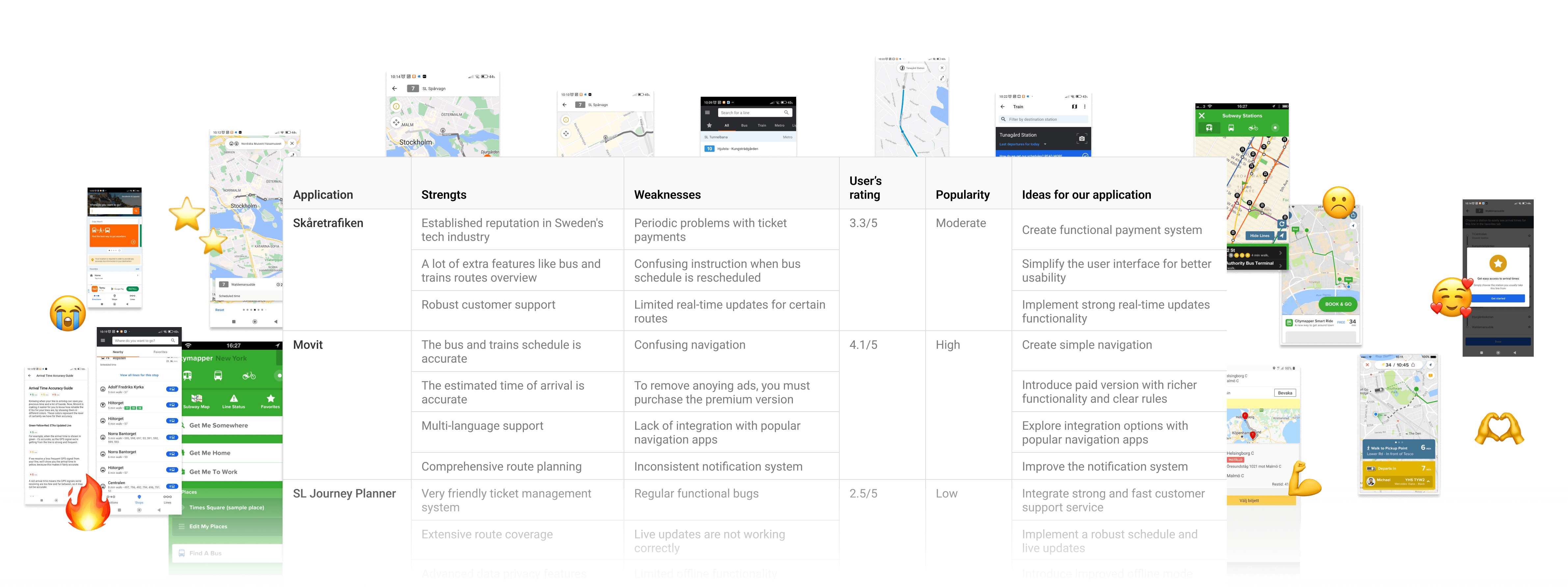
Analyzed transit apps like Såretrafiken, Movit, and SL Journey Planner to identify usability gaps.
In a focused team workshop, we analyzed survey data from 102 users to identify key pain points. Through affinity mapping and prioritization, we transformed feedback into actionable goals and established clear success criteria for our design solutions.
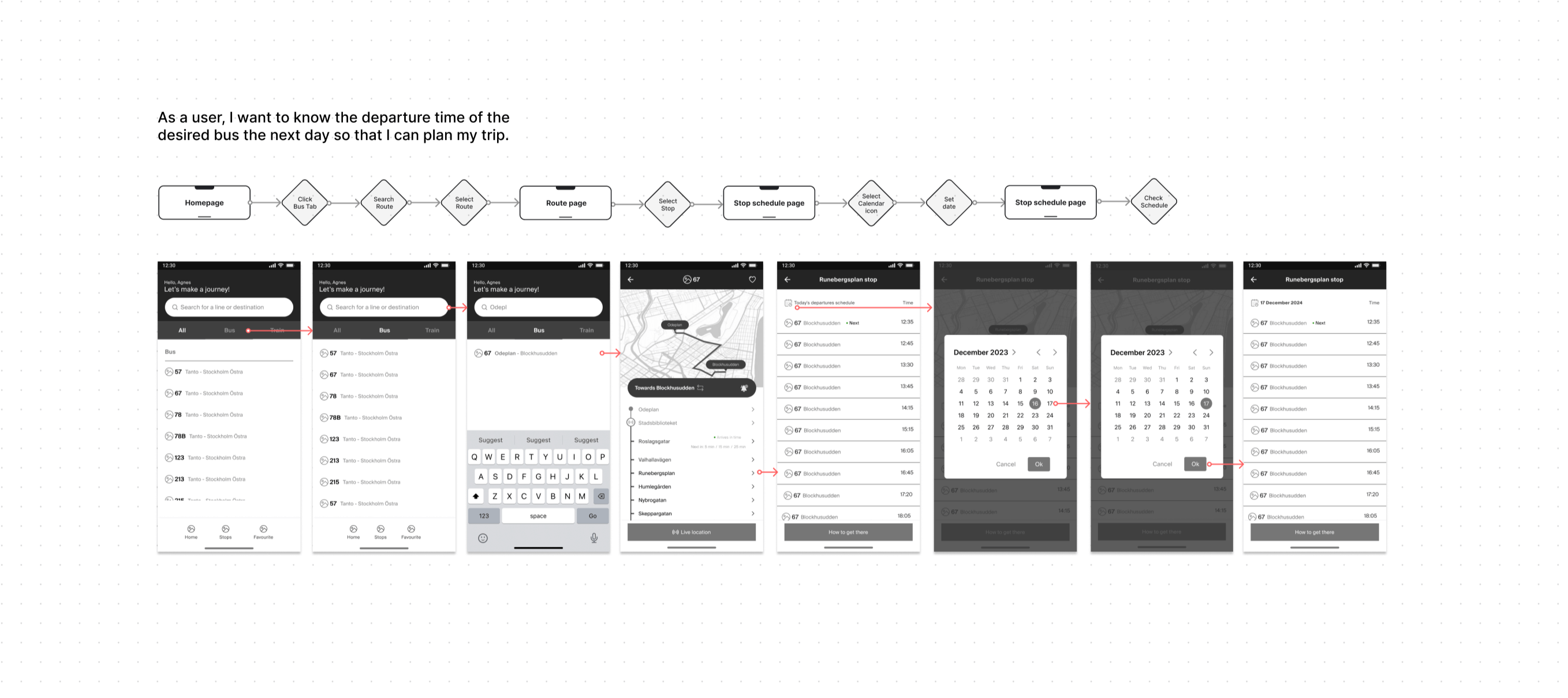
I created detailed wireframes in Figma to establish the app's structure, focusing on intuitive navigation and feature placement. These blueprints prioritized real-time tracking visibility and simplified trip planning to directly address key user pain points.
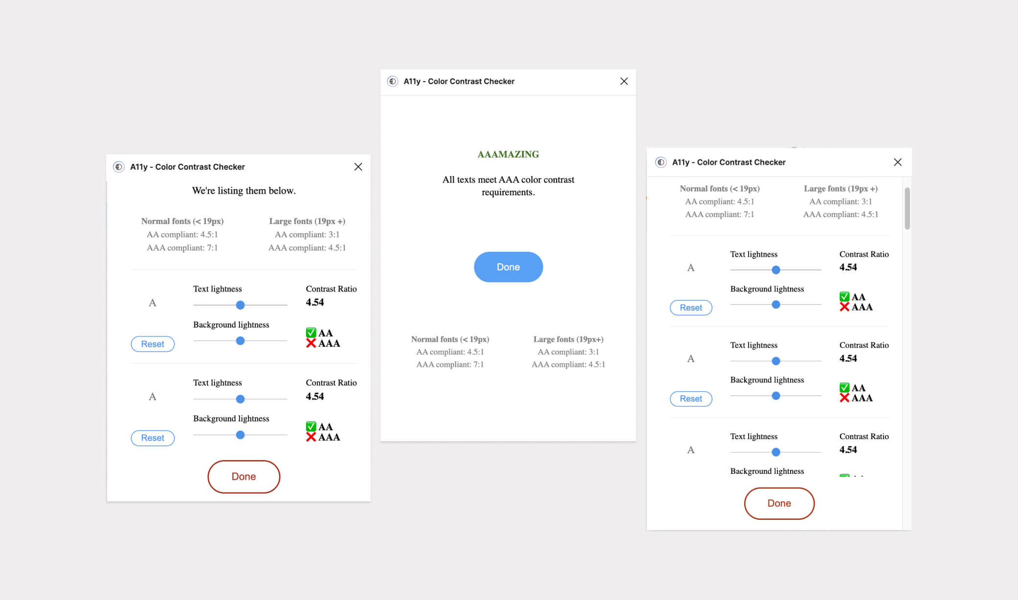
I prioritized WCAG AA compliance throughout development, using Figma plugins for contrast checking to ensure usability for all commuters.
Establishing a token-based design system early enabled consistency, dark mode support, and simplified collaboration between design and development teams.
A/B testing revealed 35% higher satisfaction for the optimized design.
The result? A modern MVP app designed to make trip planning faster, smoother, and frustration-free. Watch it in app promo video.
While I wasn’t part of the final launch phase, the design system, usability insights, and feature prioritization I delivered set the stage for a scalable and user-centered release.
Users took 63s → 45s to plan a trip in usability tests.
Streamlined menu improved trip-planning feature access.
Standardized components cut UI update time by 28%.